Your browser version is too low, it may lead to sites not normally access!
You can use the site to function properly, use these browsers.
Your browser version is too low, it may lead to sites not normally access!
You can use the site to function properly, use these browsers.
The design of Hua and Hua aims to pursue the ultimate beauty and the ultimate beauty. What is the ultimate beauty? This is just like what is said in "The Ode to Sexuality by Deng Tuzi": "The son of the Jing family, if you add one point, it will be too long, and if you subtract one point, it will be too short; if you add powder, it will be too white, and if you apply Zhu, it will be too red." It means that everything is just right.
That is to say, what Hua and Hua pursue is an image, a logo, or the birth of a symbol. If each of its lines is thicker, it will be too thick, and if the lines are thinner, it will be too thin. At the same time, in graphic processing, increasing the distance between different elements a little further would be too far, and bringing them closer would be too close.
They are each in the most perfect and precise position. Moreover, the concepts it conveys and the signals it releases must be very clear, without any noise at all. Only in this way can it ultimately achieve the effect of visual communication.
Huaban also said at the annual meeting, "Huahua and Huahua's mission is to establish standards for design aesthetics in China, to achieve ultimate beauty, and to improve the aesthetics of the entire Chinese market."

So, in this article, we will share with you the creative process of the Kuangdi insulated cup super symbol, taking you back to the birth of a super symbol and the processes that need to be experienced in China.
The author of this article, Xiang Leshuang, is the main project designer of the Kuangdi project.
▲Analyze the detailed process from Figure 1 to Figure 171 for you
In the early stages of the Kuandi project, we clearly defined the need for a supersymbol to accurately interpret the concept of "insulation" in Kuandi products.
In the process of creating super symbols, there are multiple creative directions, and it was not until we determined Kuangdi's brand proverb "Kuangdi insulated cup, tomorrow will still be hot mouth" that the direction of the symbol was determined. After the brand proverb was confirmed, our project team was very excited because it allowed for the integration of discourse creativity and symbolic creativity to interpret the concept of "insulation" and release greater signal energy!
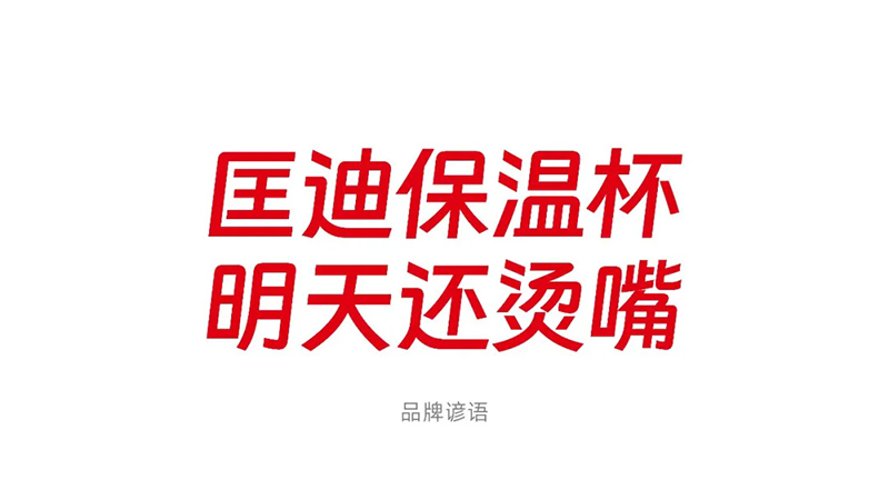
So, we are also more certain that Kuandi's super symbols should revolve around the common experience of using insulated cups, such as "keeping warm", "scalding the mouth", and "scalding the mouth to the point where the tongue hurts", using symbols to expand imagination and concretize this experience. This is a challenge, the difficulty lies in how to express the concept of "hot mouth" in a concrete graphic?
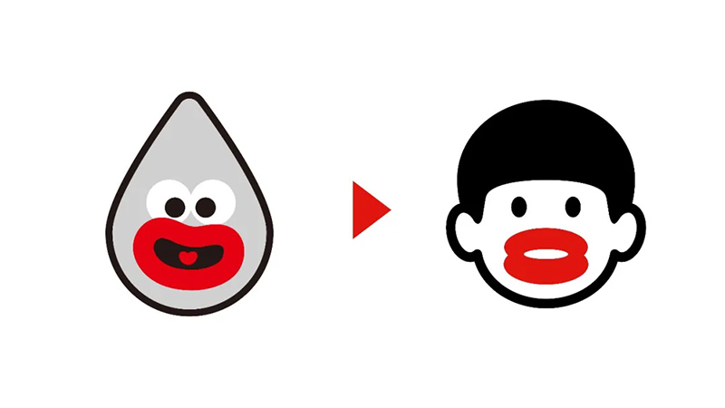
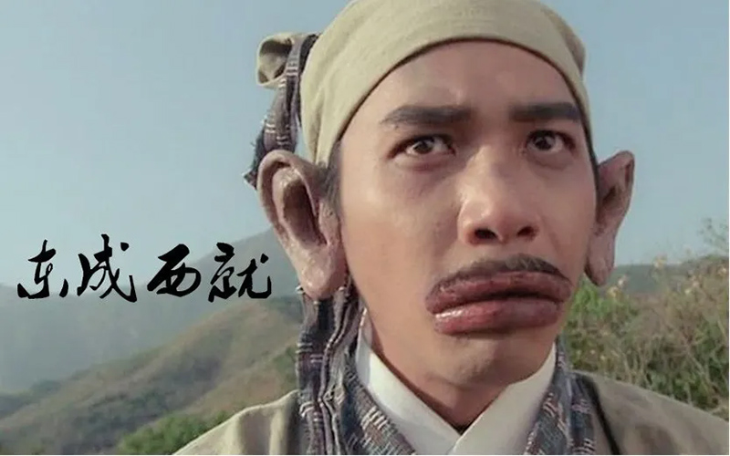
After several rounds of creative discussions, when Huaban saw Tony Leung's sausagemouth image in the movie "East and West", they said, "This can become the matrix of our hot mouth symbol." With this very specific source of inspiration, our design work can also proceed more smoothly.
From this stage on, for me, the creativity of this super symbol actually turned into a proposition essay. Before starting the hands-on design, I also conducted in-depth thinking. I not only need to achieve the creative idea of hot mouth, but also ensure the aesthetics of the symbols and the effectiveness of their use in the product.
For the creation of the Kuandi thermos super symbol, I need to achieve at least three points:
1) The symbol must have identification points with the morphological characteristics of "hot mouth", which are clear at a glance and can be easily recognized;
2) Having both the attributes of a public symbol and the ability to be privatized, it possesses the uniqueness of the Kuangdi insulated cup brand;
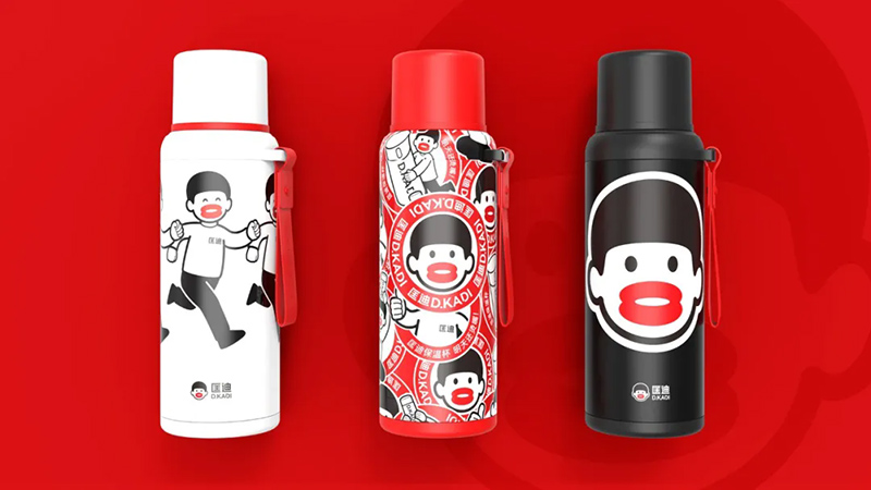
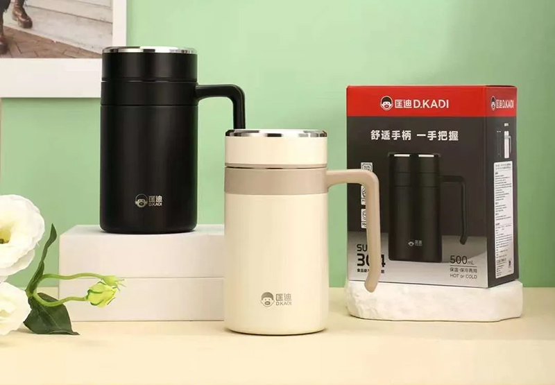
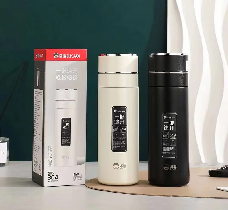
3) Can achieve better results in product use. Kuangdi's metamedia are our insulated cups, glass cups, and teapots. The area of symbol display on the bottle body and cap generally does not exceed 45mm, and the process is mostly in monochrome screen printing, heat transfer printing, and laser marking. The symbols can also be easily recognized at this size and accuracy, and the symbol needs to be concise enough.
Our partner Song Yahui also said, "The symbols on our cup and kettle products must be concise enough.". The symbol area on cup and pot products is small, and there are two most commonly used printing methods, laser engraving and screen printing, which require the symbol to be simple enough for easy application.
Based on these requirements, I believe that in terms of design, we can try to combine multiple symbols, highlight mouth proportions, highlight hot mouth expressions, and depict facial features of the head.
Observing the original appearance and finding patterns
All creativity and craftsmanship come from observation. The first step in design is to search for the prototype of the hot mouth, study the recognition features of the hot mouth, extract the expressive characteristics, and finally reflect them on the symbols. Searching through Qifeng to draft, only by extracting a large amount of observations and characteristics, can we calculate everything, know where the mechanisms are, and know how to operate them.
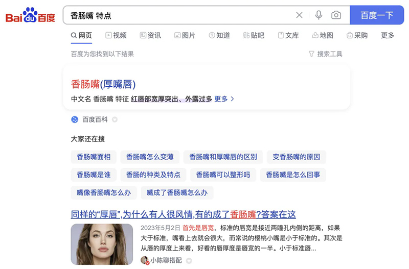
What is searching for Qifeng to draft? To put it simply, it means looking for references, summarizing patterns, identifying characteristics, and then using them in one's own design. What is the simplest way to search for Qifeng draft? As long as you type the keyword for this question in Baidu's search box, such as "Sausage Mouth Characteristics", you can search for multiple characteristics.
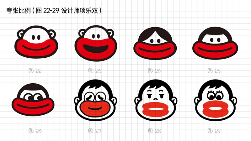
Based on further reference and organization, it can be summarized into three categories: larger proportion on the face, thicker lower lip, and wider lower lip.
In this way, we can use graphics to reflect that the lips have an absolute high proportion, whether in the mouth itself or on the face.
Design Exploration
After summarizing the characteristics, we can try symbols based on creativity and start drawing. In my attempt, I identified two key points:
1) Symbols should highlight the key points, reduce design noise, avoid being too dramatic, and highlight the dramatic effect of hot mouth. Throughout the design process, the key is to understand what needs to be expressed.
2) Symbols should make people happy, conform to the design principles of points, lines, and surfaces, have a compact structure, and conform to the basic aesthetics of logo design.
Based on these two key points, I will begin to explore some design aspects:
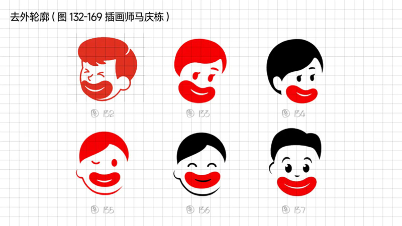
1. Attempts to superimpose symbols
At the beginning, a routine was created using the most common symbols of adding multiple symbols, namely "Sausage Mouth+Panda", "Sausage Mouth+Water Drop", "Sausage Mouth+Monkey", "Sausage Mouth+Letter D".
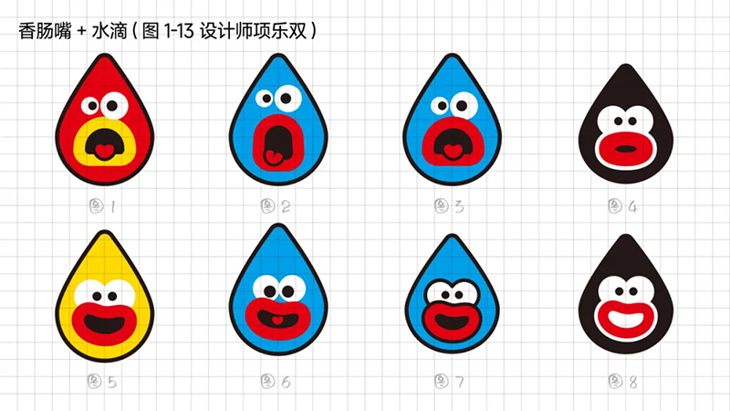
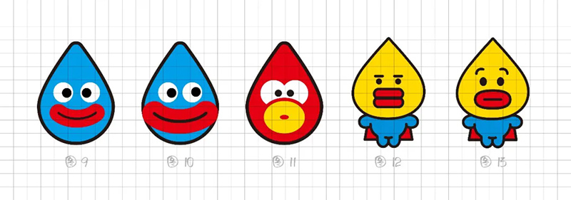
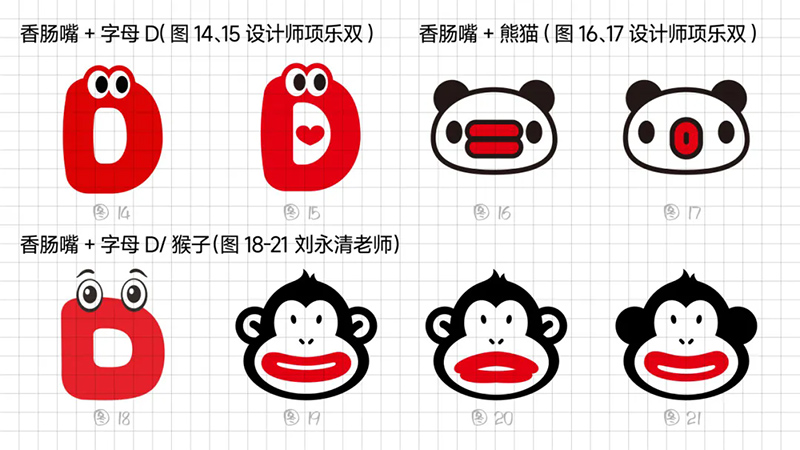
Hua Ban said that none of these works. This is a question about the order of experience. When our senses receive information, it forms an experiential order after being processed by the human brain. Above the order of experience, it is our consciousness. For example, when people see this big mouthed monkey symbol, what do they first associate with? At first glance, people's first thought of it is that it is a monkey.
Meanwhile, we also need to think about how people would describe this symbol? Hua and Hua talk about "broadcasting", and the key to "broadcasting" lies in paraphrasing. What words do you want people to use to paraphrase it? This needs to be designed and understood from the beginning.
If we use pandas or monkeys, people will definitely say they are giant billed pandas or monkeys. The conclusion of giant billed pandas or monkeys falls on pandas or monkeys, and people will not remember the sausage mouth, let alone know that it was scalded. Because in the order of public experience, the order of "panda or monkey" must be higher than the concept of "hot mouth" that we want to express.
Essentially, what we want to achieve is to have people rephrase it as "hot mouth", and it is being scalded by Kuandi insulated cups, which is what we want, so we need a single, simple signal.
For this single signal, we continue to make adjustments and plan to highlight the feeling of being "hot" by exaggerating our mouths. The process is as follows:
2. Exaggerated approach
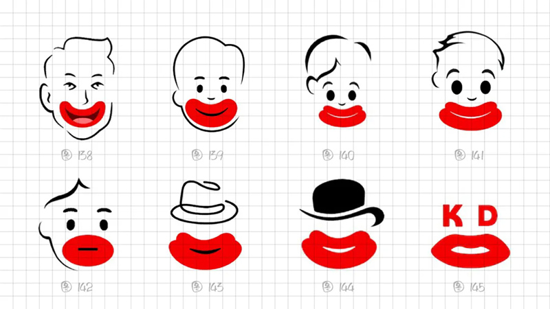
1) Exaggerated proportion: In planar composition, specificity is a technique of expression that enhances recognition and uniqueness. Seizing the characteristic of the sausage mouth with a large facial proportion, we try to magnify the lip contour to the extreme, exaggerating it to be even larger than the face.
2) Exaggerated expression: From exploring the shape of the lips, to the size of the curved smile on the surface, to the expression from burning to exhaling, to the attempt to adjust the change from burning to sticking out the tongue, I want to use my facial features to assist in expressing the moment of burning, to grasp the moment of surprise, carefully drink hot water, or feel comfortable drinking hot water.
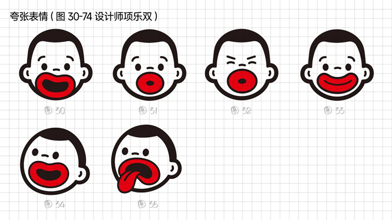
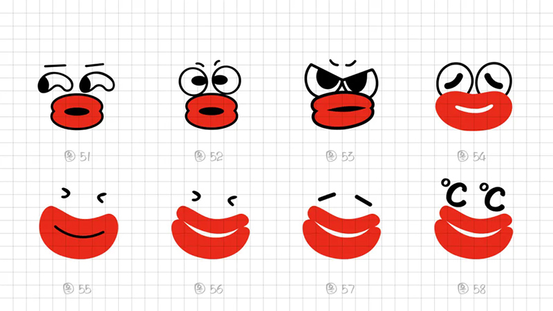
However, these attempts did not actually meet the standards we wanted. Upon review, it can be seen that the inadequate design of these plans is actually due to excessive noise. These design noises are competing for creative scenes, and their signals are not singular enough. Further simplification is needed.
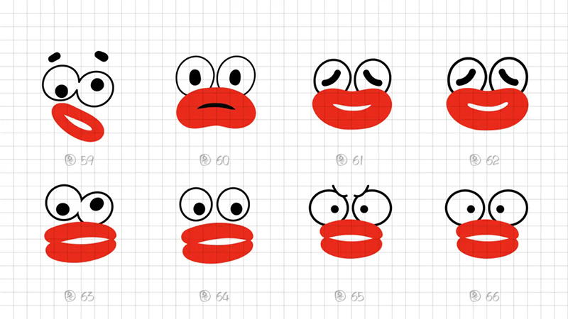
3. Minimalist approach
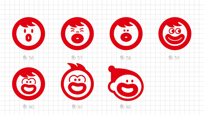
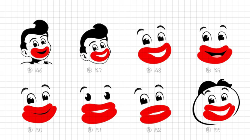
To simplify, it means subtracting. Subtraction first reduces the concept, retaining only the hot mouth and removing noise such as monkeys, water droplets, facial expressions, and so on.
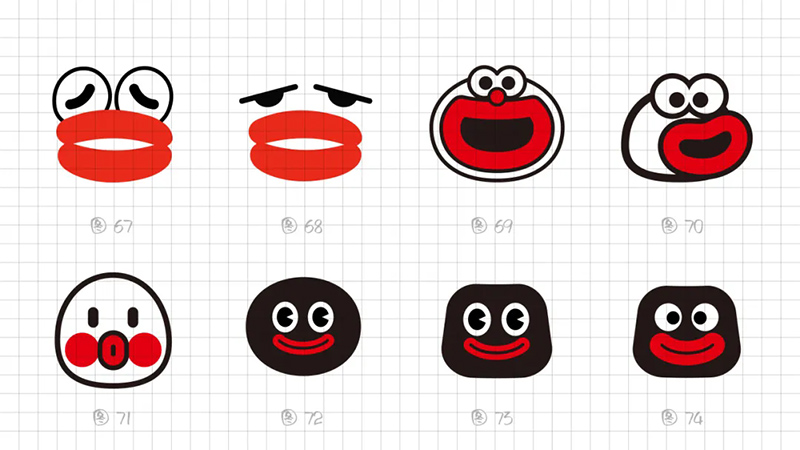
1) Attempt at head angle: Try to turn the character's head over to highlight the volume of the sausage mouth. Combining the quick puzzle method to quickly generate symbols, it was found that the direction did not achieve a special effect, sacrificing the minimalist axis symmetry strategy. However, the overall temperament was not strong enough in terms of tension and impact.
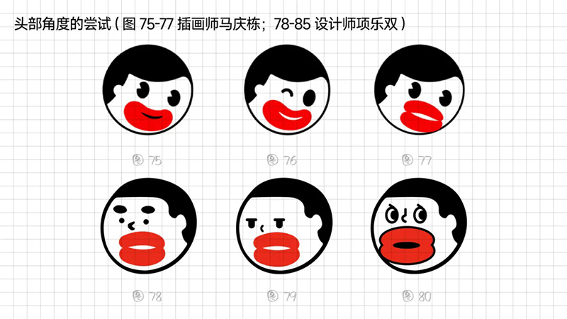
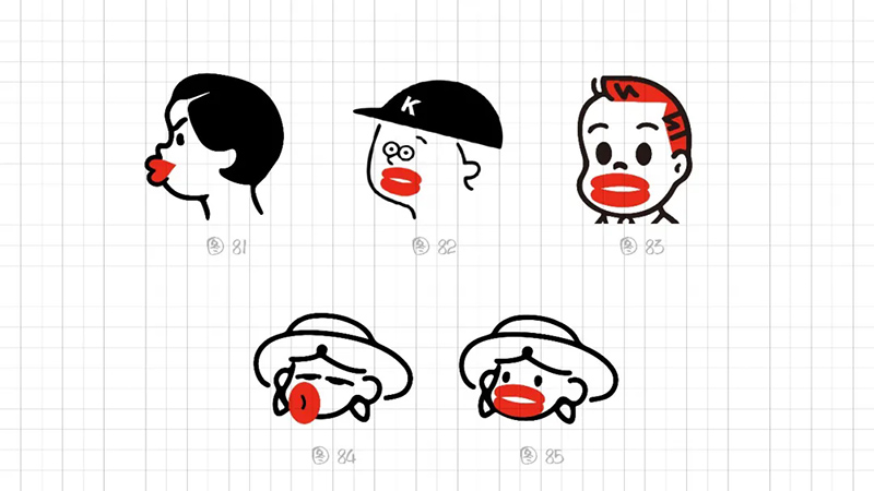
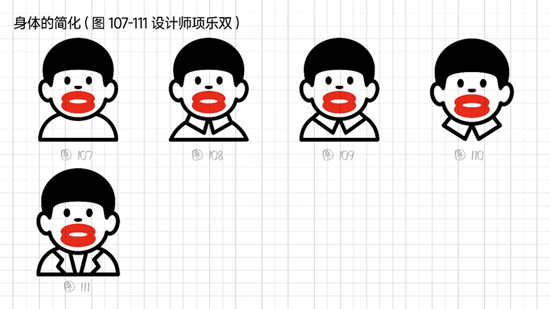
2) Simplification and deletion of the body: After several rounds of attempts to modify it, we ultimately locked in the axial symmetry of the composition. Our main visual experience is hot mouthed brother's lips, and the body parts can be simplified or even deleted. In this way, our visual center remains on the face, and the overall visual language of the graphics is also more concise.
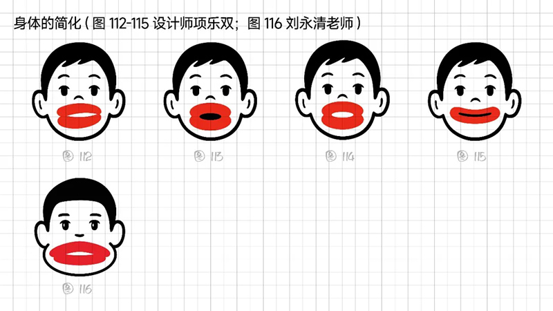
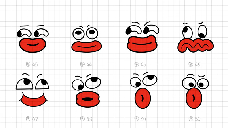
3) Geometric refinement: The eyes, eyebrows, and nose are reduced to a single cup, and when used as monochrome, many details will be blurred, resulting in a greatly reduced final presentation effect. Further simplify the individual elements in the symbols, refine the facial features, remove eyebrows, nose, hairstyle details, and summarize the face into a standard circle. At the same time, it was found that this handling technique gives people a sense of distance, lacks grounding, and lacks a bit of familiarity. Refining and simplifying also require mastering a balance.
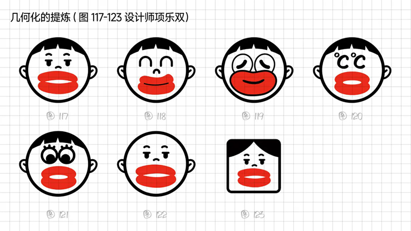
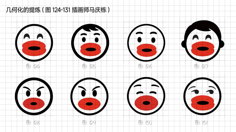
4) Can we simplify our thinking and make it more concise? Can we simplify, blur, or even delete all elements that can recognize a face? Try retaining only the eyes, eyebrows, and mouth to recognize. However, removing the expression technique of the outer contour will make the overall shape appear scattered.
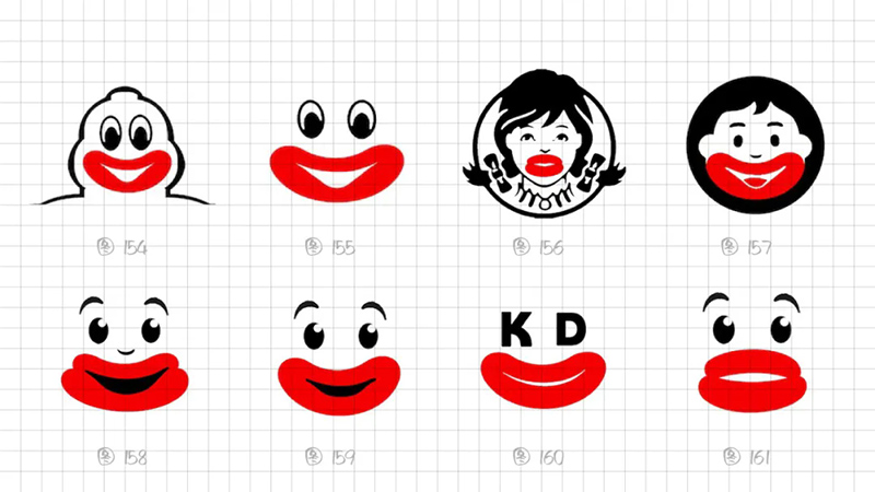
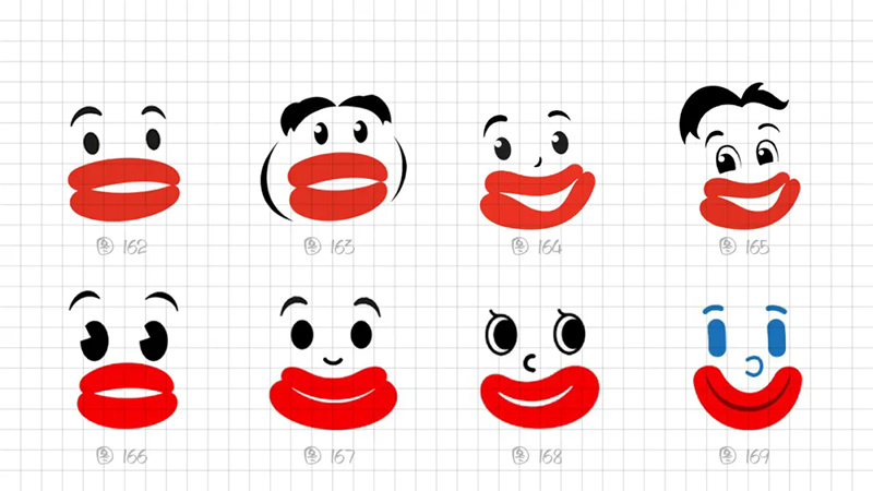
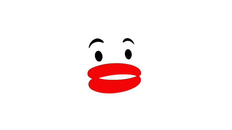
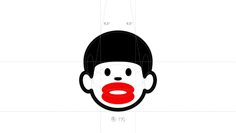
Summarize all trial plans on June 1, 2023 and report to the Huaban board. After looking at it, Hua Ban pointed to Figure 162 and said that there was a slight burning sensation in this direction. So, how to design the feeling of lips being "hot" is the top priority of this symbol design.
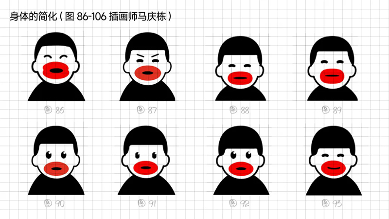
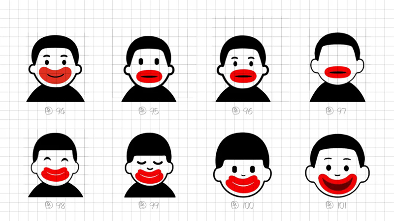
5) Extraction of lip shapes: Through different attempts at realism, summarization, refinement, and transformation, we have reorganized and reviewed the simplified shapes of the lips, which are mainly divided into two types in terms of composition: whether they are two ellipses or a transformation of three ellipses (as shown in the figure below).
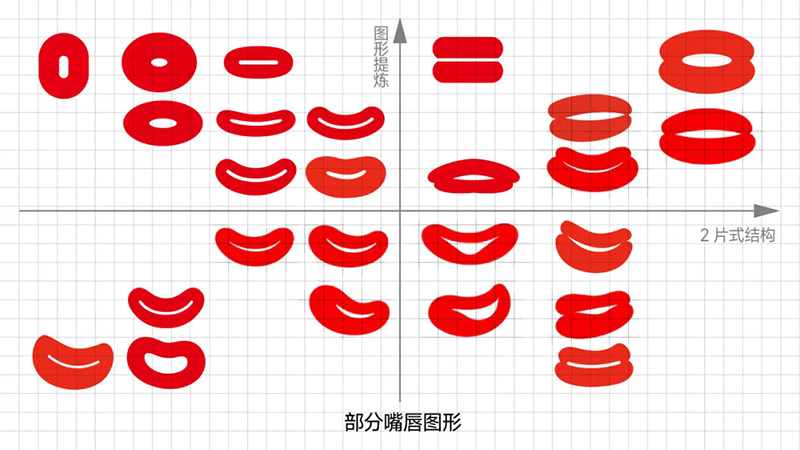
From a recognition perspective, we ultimately focus on using a 2-piece structure, 3 geometric ellipses, and absolutely symmetrical graphics to highly summarize the performance characteristics of the hot mouth. Adjust the graphics in detail to make the lower lip thicker and wider.
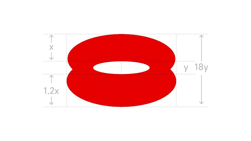
6) Adjusting proportions and simplifying details: The result of things always appears unconsciously, using the simplest form of expression - combining flat bangs with hot mouthed hair, forming a geometric surface for the hair, and achieving balance with the lips through graphic weighting. The overall contour lines are equally thick, and the two elliptical points of the eyes add the finishing touch.
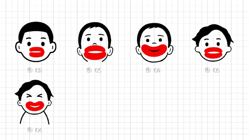
The artistic refinement and processing of dots, lines, and surfaces, such as bold lines, balanced symmetry, and minimalist symbols, are meticulously calculated from details to the whole. The correspondence between lines, bangs, lips, ears, and sideburns is very harmonious in overall proportion (Figure 170).
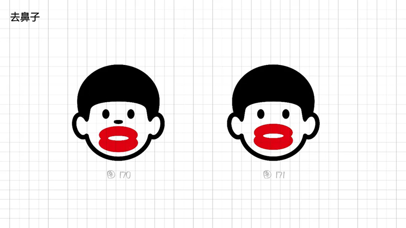
We will summarize the plan again at the meeting on Monday, and Huaban was selected at a glance. Later, after slight adjustments, the project team leader Zhou Yunfeng said that facial expressions can still be subtracted by removing the nose and strengthening the protruding sausage mouth, which can be recognized at a glance.
We showed it to Huaban as soon as we made the changes, and Huaban said "this plan is okay". Finally, we decided on this plan (Figure 171).
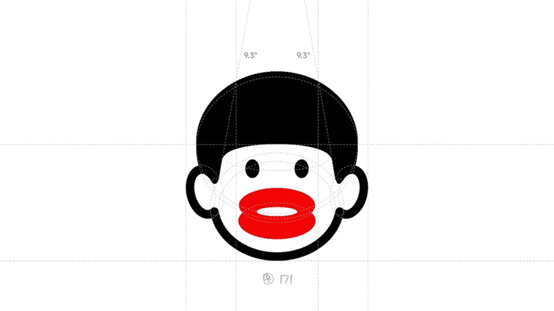
All the shapes you see are circular deformations and repeated arrangements. The graphics are concise, the combination of dots, lines, and surfaces is appropriate, the overall contour is smooth, and the visual center is concentrated.
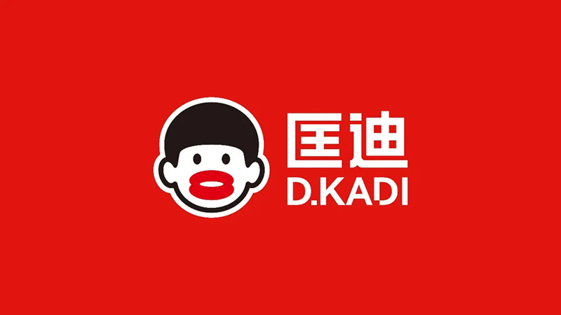
The Kuangdi super symbol "Hot Mouth Brother" has a distinctive sausage mouth that is not only memorable to everyone, but also unique and easy to recognize when applied to cup and pot products.
After we completed the design of "Hot Mouth Brother", we also completed the design of the advertising screen, but in fact, Nan Shen was not satisfied. He said, "It's not hot enough yet. Who knew this mouth was swollen from being burned? It lacks self-awareness."
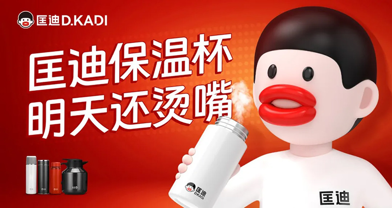
▲Advertising images and guidance before Nan Shen's guidance
Based on the opinions of the two bosses, we finally made two adjustments: one was to change the original red background to white, and the other was to create a more impactful and emotional design for the expression of "Hot Mouth Brother". Nan Shen's soul suggestion on the character's expression further elevated this symbol to a higher level.
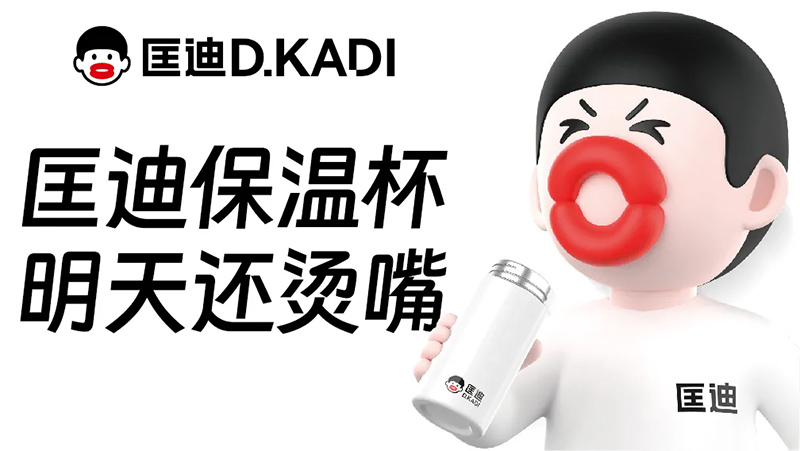
▲After modification, the final out of the street version
The above is the birth process of the super symbol "Hot Mouth Brother" for Kuangdi insulated cups. In summary, there are two main points to the design of super symbols:
1) The signal expressed in the design should be singular and simple, and we need to find the key that can be described or paraphrased.
2) The process of design is to constantly clean and clarify. To eliminate all design waste and eliminate any unnecessary elements. For example, in the end, we cleaned up the nose of "Hot Mouth Brother".